Qamar Al Sahra — Desert Moon
Positioning · Naming · Visual identity · Brand guidelines
Scope of delivery
Overview
An ultra-luxury desert resort of fewer than forty suites across four kilometres of private desert. Its audience is as narrow as the market gets: royal households, company founders, and connoisseur travellers who collect rare destinations the way others collect art. You do not sell to these people with promises — they already own everything they are promised. We built the resort a complete identity system, from the positioning question through to a ninety-one-page brand guideline governing every application after our handover.
The challenge
Most luxury hospitality brands compete by volume: more gold, more adjectives, more exclamation. But this resort's guest lacks nothing that is usually offered them — they lack time, privacy and silence. So the first challenge was to build a brand that sells luxury through restraint rather than excess, and convinces someone who has everything that this is the place where nothing is asked of them.
Beneath it sat a practical challenge no less difficult: an identity that would live on contradictory media at once — stone carved and struck by desert sun, printed paper touched by a guest's hand, and a phone screen two fingers wide. A system that works on one and fails on another is not a system; it is a picture.
The solution
We built the identity on one idea governing every decision after it: 'the moon does not announce itself.' The idea is not a marketing line but a decision test — every proposal that followed was asked: does this announce, or does it wait to be discovered?
From it came a quiet nocturnal visual language and three operating promises that translate philosophy into daily behaviour a receptionist understands, not only a designer: guard the silence, honour the culture, perfect the invisible. The whole system was then set into an eight-chapter guide ordered by the guest's journey rather than the designer's taxonomy: from the story to the mark and elements, then paper, arrival, night and screen, closing with a governance chapter that protects the identity after we leave.
How we worked
- 1A positioning session with the Office of the Founder — who is the guest, and what do they actually buy?
- 2Writing the central idea and the three promises before drawing a single shape
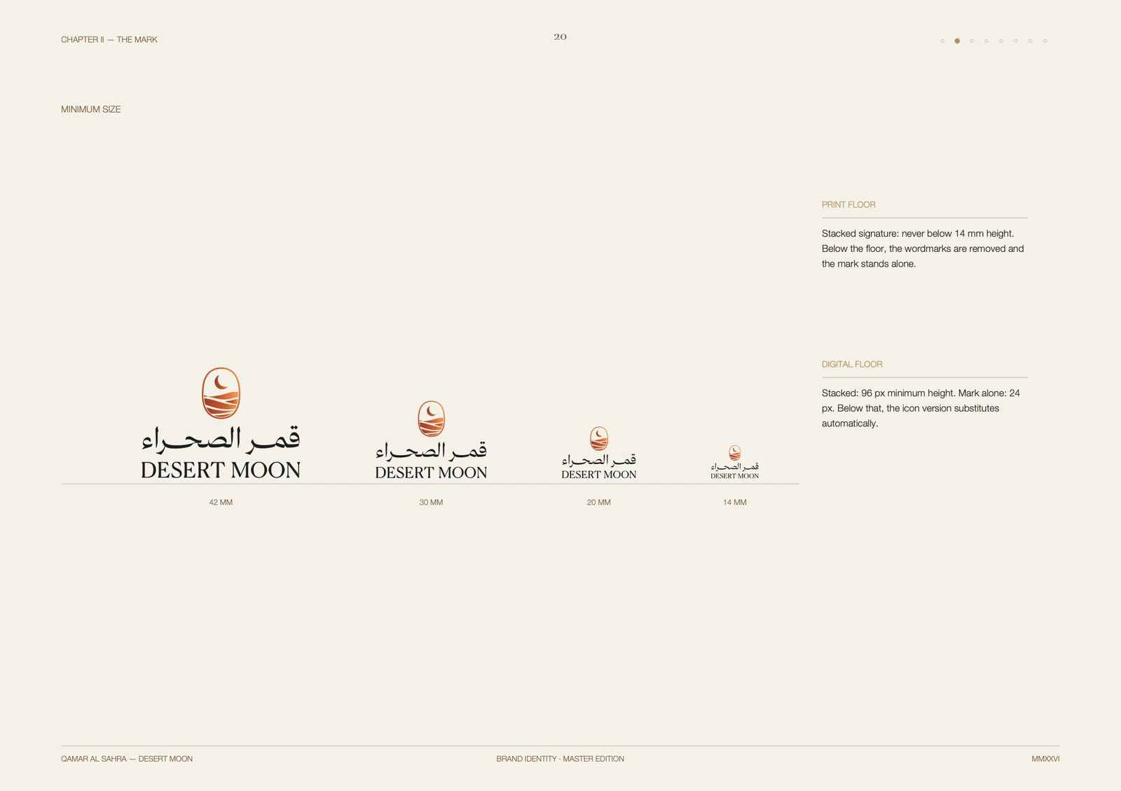
- 3Building the mark in Arabic and Latin, with minimum sizes set for print and screen
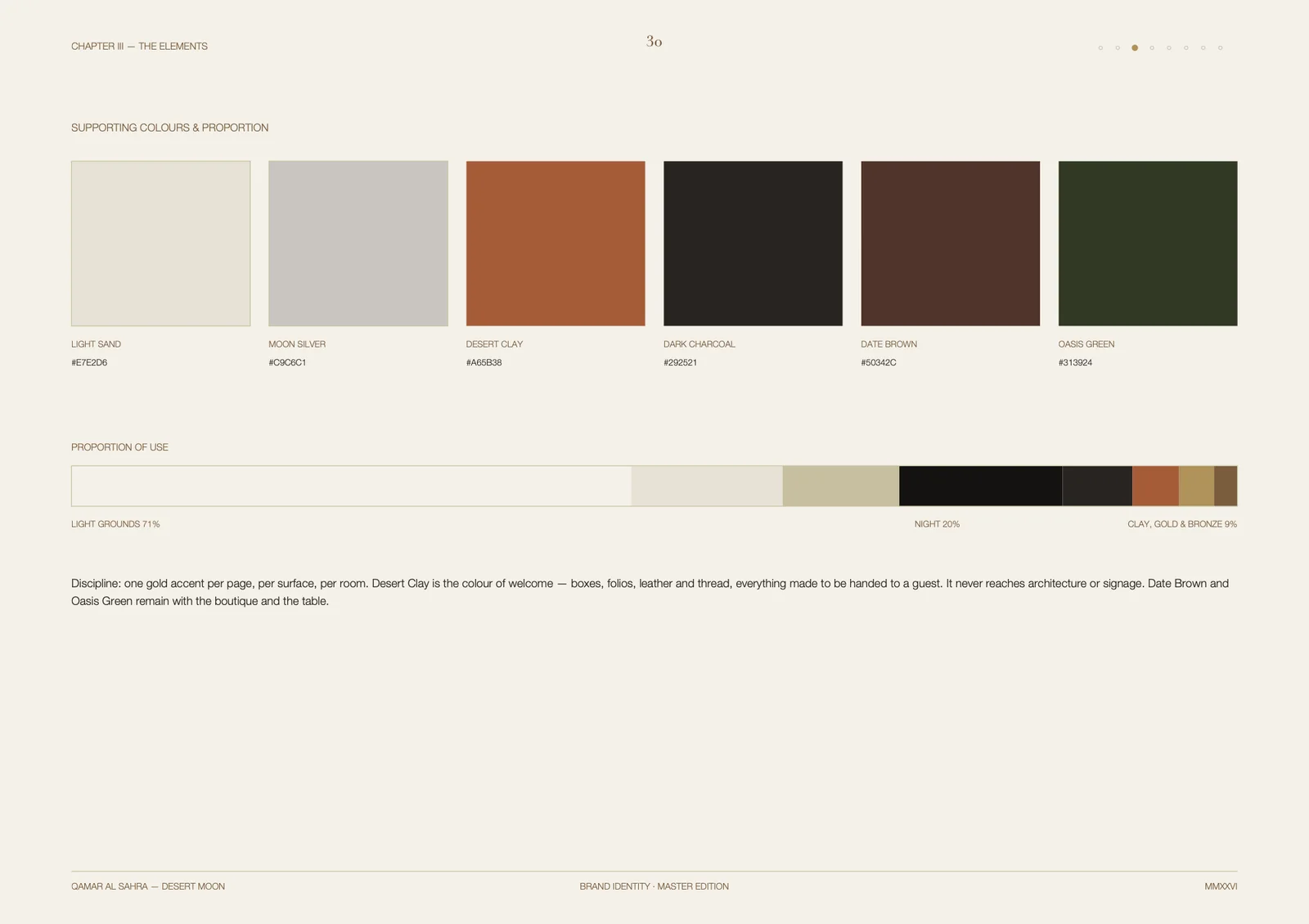
- 4A colour system with governed proportions: light grounds, night, and a clay-gold accent
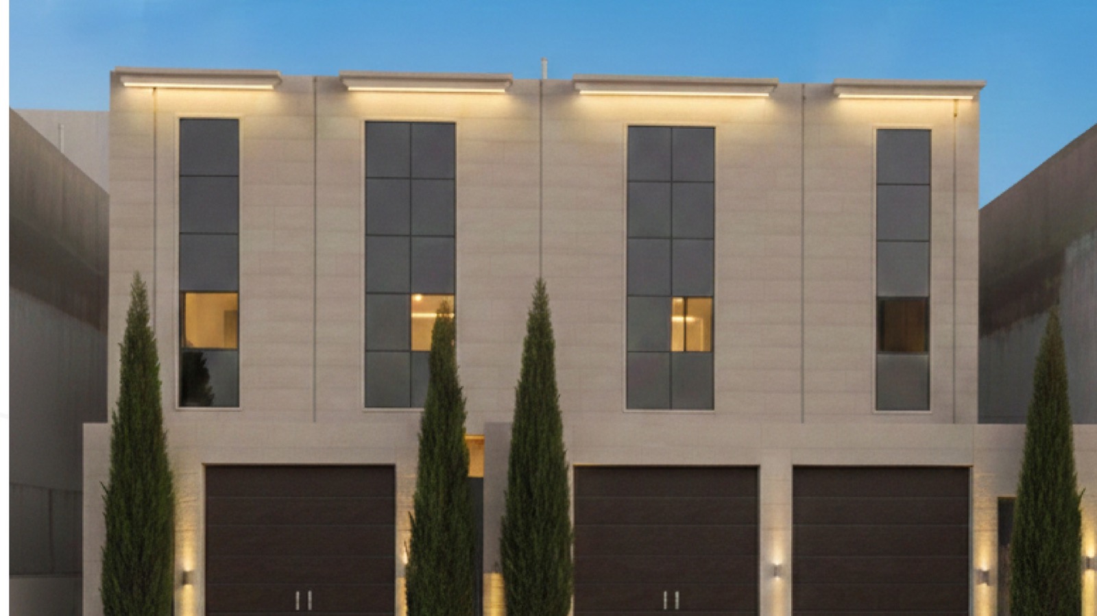
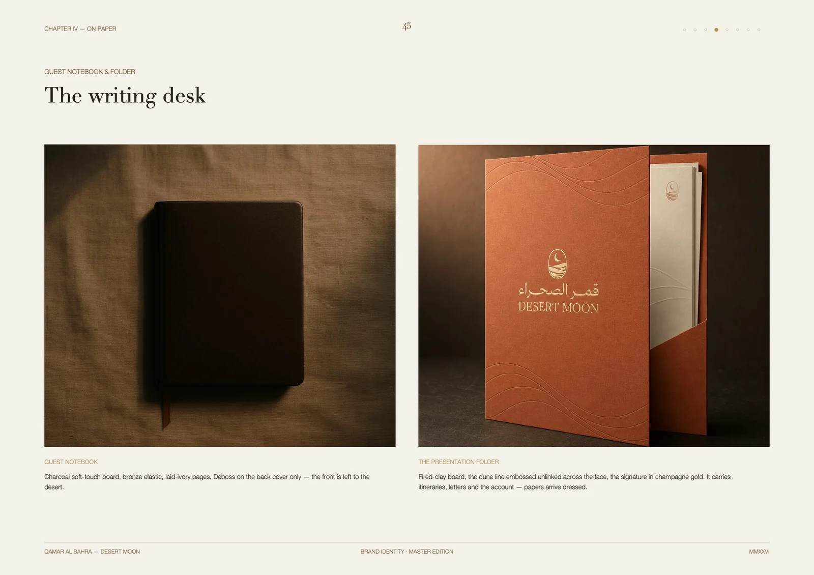
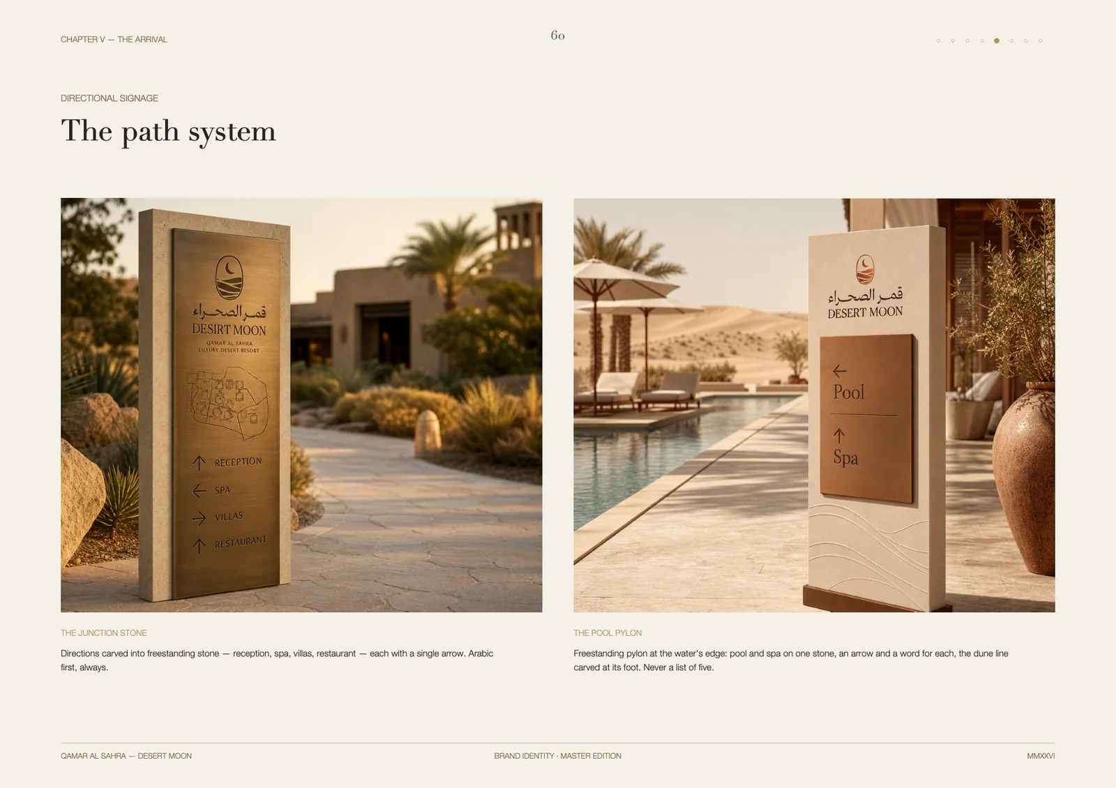
- 5Tangible applications: the guest notebook, the presentation folder, and a carved wayfinding system
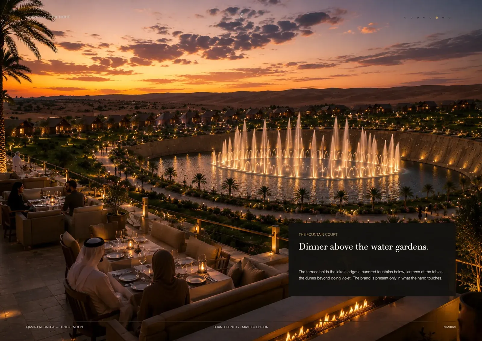
- 6Image language: a nocturnal art-direction reference governing all future photography
- 7The governance chapter: who approves new applications, and how the master artwork is preserved
Deliverables
- Positioning document and target guest segment
- The mark in Arabic and Latin with master artwork files
- A six-colour system with codes and usage proportions
- Bilingual typographic system
- Image language and nocturnal art-direction reference
- Paper applications: guest notebook, presentation folder, correspondence
- Carved on-site wayfinding system
- A complete facilities icon set in the brand style
- A 91-page brand guideline in eight chapters
From the brand guideline
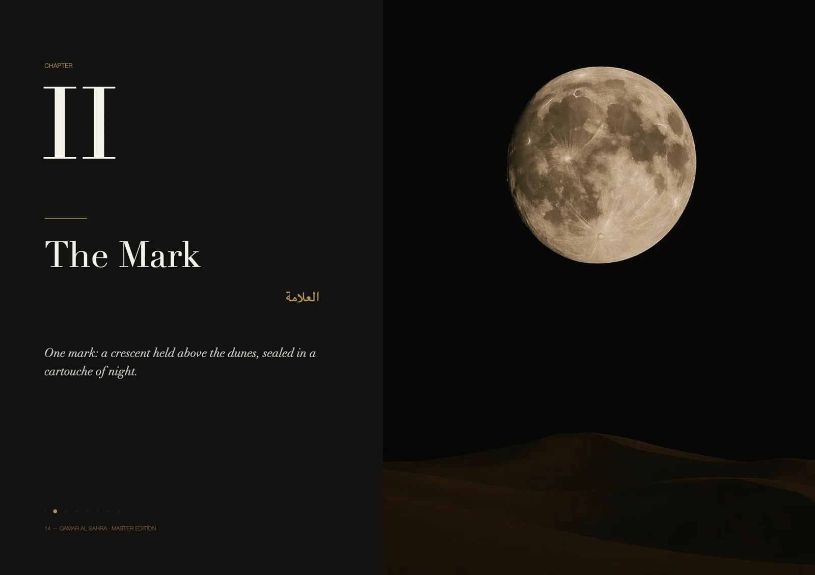
«Luxury here is not what is added but what is removed: no noise, no crowds, no hurry. The identity's task is to say this without saying it.»